
The Nike Run Club app is one of the top rated running apps, built on the strength of the prestigious Nike brand. The Nike Run Club app is very popular among runners, thanks to its robust features and strong brand backing. It offers comprehensive tracking for distance, pace, time, and calories burned using GPS
This is a project that I completed for the Designlab course. The challenge was to take an existing app and develop a new feature that would fill in seamlessly with the existing platform while solving a real user need.
Role: UX/UI Designer Tools Used: Figma, Miro Time Frame: 2 Months
Runners wanted More Than Miles
I wanted to give Them Meaning
Runners don’t just want to track where they’ve been—they want to see where they’re going. I created a metrics experience that supports long-term goals, celebrates progress, and keeps motivation high beyond the finish line.
Many NRC users hit a wall after completing a training plan, with little feedback on long-term progress. I set out to create a feature that makes every step count by visualizing trends, goals, and growth over time.
Discovering the challenge
Research
Where to start in adding a feature to an already outstanding app? I began by taking a comprehensive look at the app itself and 4 of its top competitors, Strava, Map My Run, and Runkeeper. I downloaded the other apps and went for runs using each of the other apps (I regularly use the Nike app). Additionally, I read user reviews in the app store and articles about the top running apps on Runner’s World, CNN, and Tom’s Guide. I wanted to get a feel for Nike Run Club’s strengths and weaknesses compared to its competition in order to discover opportunities to add a feature that could help the platform compete or that would build upon its current strengths. Through this methodology, I intended to build some assumptions around which I could develop the best questions to ask users.
Talking to the right people
I set up interviews with users of running apps. Some participants were users of the Nike Run Club app and 4 of them use one of the other apps. The participants were of a range of running types. Some were veteran runners who have completed marathons and others are relative beginners who run for exercise. I was particularly interested in the veteran runners, as Nike Run Club tends to cater to novice runners and I wanted to ascertain what veterans need from their running app to see if I could come up with a feature that would convince them to switch from their app of choice.
Defining the Challenge


Through a comprehensive analysis of Nike Run Club and its top competitors—Strava, Map My Run, and Runkeeper—and user interviews from a range of runners , I identified key areas for potential feature enhancements. Interviews with a diverse group of runners revealed a strong desire for customizable training plans, robust route planning and sharing, and the ability to view long-term running metrics. Veteran runners, in particular, highlighted the need for features that cater to their advanced training needs. Addressing these insights can help Nike Run Club attract more serious runners and enhance its overall user experience.
Customization: Users seek adaptive training plans, goals, and feedback tailored to individual progress.
Route Planning and Sharing: Need for safe, reliable routes with turn-by-turn guidance and social sharing capabilities.
Long-term Metrics: Desire for tracking and comparing progress over time, a feature currently missing in all major apps.
Veteran Runner Attraction: Enhancing advanced features to meet the needs of experienced runners can help draw them to Nike Run Club.
Bringing the users to life
From the data gathered from interviews and analysis, I developed two personas. I took elements from the perspectives and experiences of my interview subjects and imagined Alyssa and Jake, a veteran runner and an enthusiastic beginner.
Project Goals
Through comparing the business goals to that of the user, I was able to see some key, actionable overlap. The key to this overlap are the shared goals of “enhanced user athletic performance” and “to be motivated in a positive way.”
I want to create an added feature to the Nike Run Club app that will help users to enhance their running performance through the use of thorough, easy to view metrics that include an element of coaching and motivation based on the runner’s goals and progress.
Focus
As the project problems and goals began to come into focus, it became more clear that the serious and competitive runners would be difficult to lure away from apps like Strava without investing in more than a single added feature. In order to keep the project time and potential budget constraints I decided to focus on building upon Nike’s strengths when building the enhanced metrics feature catered largely to beginning and intermediate runners
Spinning Needs into Features
Once I established the needs of the users and the goals of the project, I began to brainstorm ideas for solutions. I began by creating thought webs exploring as much as I could in a short period of time. Once I completed the web, I focused on the ideas that seemed the most exciting and practical and put them into a prioritization chart. This chart helped me to be able to see which of the ideas were necessary, which I might want to stretch to achieve for the sake of delight, and which would need to wait for a later expansion of the feature.
Shaping the Experience
The process of shaping the feature was like building a clay sculpture. There was a building up of feature ideas to solve the user’s needs, then a pairing down to what was necessary within the project constraints to deliver a solid MVP.
I focused on the “must have” features as the foundation of the project. The current metrics that the Nike Run Club offers are week, month, year, and all-time views for total miles run with summaries of additional metrics for just the year and all-time categories. Additionally, the app offers a metrics breakdown of individual runs with a map view highlighting mile splits of average pace and elevation gain.

Ideation
“How might we help runners visualize their progress over time in a way that keeps them motivated and engaged long-term?”
Initially, the goal setting feature was going to be solely implemented on the metrics view pages. Through making the initial user flows, I realized that users would need a way to get to the goal setting section from any of the multiple metrics views, so that they could act on setting a goal as soon as they were inspired by whatever metrics they are viewing. To achieve this without cluttering the page and interfering with the users’ view of the graphs, I decided to create a third tab in the activity section that would serve as the “goal setting” section of the experience.
From these initial task flows, I began creating some lo-fi wireframes of the basic screens. It became evident that a challenge was going to be presenting the metrics in a clear way that also fits in with the existing design patterns and style of the app while giving the users’ the greater breadth of metric analysis and choice that they need. Additionally, the comparison pages were going to be complex and I was going to need to come up with a way to give the user multiple metric views while keeping the graphics easy to read and understand.


I returned to my initial user group to run them through some A/B tests with the low-fi wireframes and have some conversations about their expectations of the screens and to get further insight into their needs surrounding the expanded metrics and goal setting. My goal was to gather details about the core aspects of the features and their understandability. The participants liked the general layout of the designs and were able to figure out how to achieve most of the task prompts that I gave them. I found that there was some confusion surrounding the metrics selection and view for the comparison page.
Building on the foundation
Taking my test participants’ feedback, I fleshed out the lo-fi wireframes into hi-fi with the aim of making the metrics toggle and display clearer and simpler and designing the metrics graph display to be clear and readable. I also wanted to incorporate a better marker for set and achieved goals in the metrics viewer.
What users needed from the metrics viewer:
To be able to see their metrics and distinguish between different metrics.
To be able to see specific numbers for each metric
To be able to see their goals in reaction to where they are and to get a feel for how close they are to the goal
To be able to get a quick reminder of what their goals are and some encouragement

Solutions:
I replaced the metrics toggles under the graph with a pop up metrics selection tray to keep the view less cluttered.
I limited the number of metrics to be viewed or compared to two.
I added 2 metrics value displays to show values from specific points in the week/month/run.
I chose red and blue to code the metrics and indicate which lines they refer to on the graph.
Current goals appear on the graph as stars, with lines to help the user to see how close they are getting to their goal. If the user taps on the star, they will get a pop up reminder of what the specific goal is as well as an encouragement.

Runners need help knowing how to take steps toward their goals.
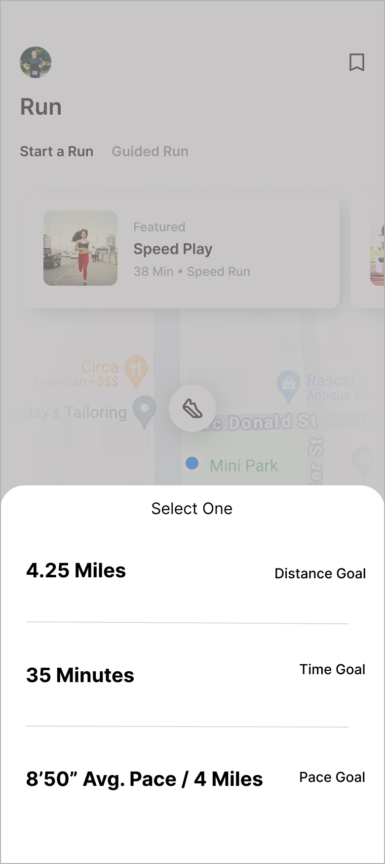
One of the features that my users were most excited about was the suggested run goal. Currently, the Nike Run Club app has a feature where a user can set a custom distance, time, or speed goal for a run that they are about to do. Part of my expanded metrics feature is to sync with the users long term goals to create an AI generated run goal based on the user’s history, current ability, and upcoming goals. Users needed to be able to distinguish between these two run goal tasks and set the goal quickly and easily before a run.


Before creating my initial wireframes, I went back to my competitive analysis research and took note of the structure and look of other learning platforms. I also studied the layouts of successful platforms that present visual work, such as Dribble and Behance. I wanted to make sure that the imagery was going to be presented well and I wanted to keep the navigation as simple as possible. I started with a number of quick sketches on paper before fleshing out the best in digitally.
Refining the structure


Continuing to circle with iteration
The process of creating the wireframes uncovered issues with my initial ideas for the structure and navigation for the site. The top navigation was proving to be redundant and overly complicated as well as the extent of the options within the “My Studio” page.

Fleshing out the design
The high-fidelity wireframes were made with the task flows in mind. I wanted the user to be “pulled” through the sign up and matching process with as much simplicity as possible.


Refining the design
A simple way of leaving feedback on work was needed, so I modeled the feedback field after a chat or text messaging interface.