
This project was born out of my own desire to enhance my focus and mental energy throughout the day. I was finding myself to be dragging throughout the day and started experimenting with techniques to break my routine and get some physical movement in. I discovered that I could improve my mental energy and focus throughout the day by adding various activities at intervals. This got me thinking whether other people struggle with mental energy and focus and if they would want an application to assist them in managing those levels.

Project Overview
Role: UX/UI Designer / Tools Used: Figma, Miro / Time Frame: 2 Months
Designing a helping hand for self-care
In today’s fast-paced and over-stimulated world, many individuals struggle with managing their energy levels effectively. Factors such as work stress, screen time, lack of sleep, and poor lifestyle choices can lead to fatigue and burnout. People often find it challenging to identify what activities can help them recharge, leading to decreased productivity and well-being.
Figuring Out Needs
The energy-tracking app space is still sparse and mostly focused on physical energy via wearables, leaving a clear opportunity to address mental energy and focus without device dependence. By studying competitors, I identified common design patterns and features, while also recognizing a central challenge: balancing useful trend insights with a simple, lightweight experience.

I decided to focus my user research on people who take an interest in personal wellness, mindfulness, and/or have particularly taxing jobs and lifestyles.

Awareness & Patterns
Users are confident in recognizing when energy is high or low, but less confident in identifying consistent patterns over time.
They see mental energy and focus as essential to performance and happiness.
Everyone acknowledged that their energy fluctuates throughout the day, with predictable peaks and dips.
Users are open to guidance on how to “surf” these highs and lows to better align tasks with energy levels.

“I would be discouraged from using the app if it was too time consuming”
- Interview Subject
Imagining the possibilities
I distilled my research into succinct problem statements in order to focus the direction of the design
Defining the Challenge by Gaining Insights
“The app needs to be easy and simple”
- Interview Subject
Needs & Concerns
Most participants expressed a need for prompts or nudges to help them recognize and act on slumps.
Users already have strategies (e.g., sleep, breaks, movement) but want customized coaching and predictions to optimize them.
They showed interest in trend insights, but only if presented in a way that feels simple and actionable.
A major concern is app fatigue: users fear the product could be too complex, time-consuming, or add to screen time — which itself drains energy.
I interviewed 5 individuals from various backgrounds who all either have interest in wellness tracking or their personal mental energy levels, have tiring jobs that keep them in front of a computer all day, or who have kids and a lot of things on their plates.


Users struggle to identify consistent patterns in their mental energy fluctuations, leading to a reduced ability to utilize the times when they have more energy and recognize when they are going to need a boost.
Users desire personalized, actionable advice but fear the app will be too complex or time-consuming. They want nudges and advice on their mental energy, but they don’t want something that is going to just add to their cognitive load.
Keeping in mind that my users were looking for an app that would not itself contribute to lowering their mental energy; I focused on making a simple site structure with the basic features of an Energy Log, Metrics display, and Tool Kit.
I created a simple initial site map to begin building my features around.
Using my problem statements as a guide, I brainstormed possible features and organized them by priority in oder to begin formulating the roadmap to a solid MVP that would deliver solutions to my users’ needs and concerns.
Generic or irrelevant notifications fail to provide value to users
Bringing the users to life
From the data gathered from interviews and analysis, I developed two personas. I took elements from the perspectives and experiences of my interview subjects and imagined Mia and Jimmy.
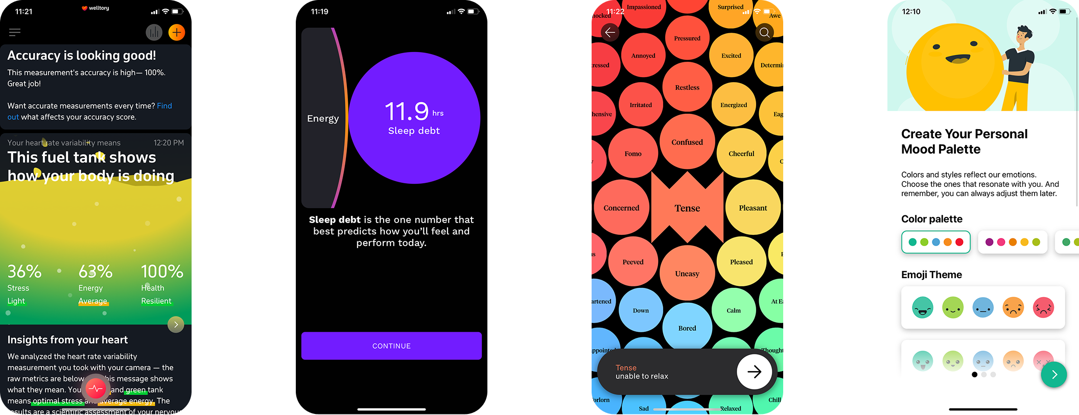
Competitive Analysis
Researched the market through articles, app store scans, and ChatGPT-assisted searches.
Focused on adjacent apps such as Welltory, Rise, Daylio, and How We Feel.
Found that the space is sparse, with most competitors focused on physical energy tracking via wearables rather than mental energy.
Building a Brand
As the platform began to take shape, I began to build the brand identity around the around core values that I believe spoke to the needs of my potential users.


After workshopping my ideas with colleagues and mentors, I started to gravitate toward the simple image of the eye combined with wavy lines that represent energy. I wanted to play with the concept of the eyes being the window to the mind and representing a glowing energy from within.
I settled on the name Mindflo, as it was simple and communicated the basic concept of the app. The final logo as alluring and simple.

I like start my design process with brainstorming names and concepts using a mind-map. From thids mind-map, I look for ideas and words that reflect my brand ideals, the product’s purpose and that would make good visuals.
I then brain storm sketches of some of the concepts that are most attractive to me. There are no bad ideas in this phase of my design exploration. I want to work through as many ideas as I can, as quickly and freely as I can.


As the logo came together, I expanded upon the tone and color of the logo to develop a style tile to help guide my design aesthetic for the rest of the project and create a cohesive look for the product. I wanted to design with a “dark mode” look with bright, uplifting colors with geometrics and gradients to communicate playfulness, sharpness, and calm while playing upon current trends in design aesthetic.

Project Goals
From the defined problem statements, the Project Goals became more clear. To bring better clarity to the holistic development of the product, I created both User Goals and Business Goals. I knew that balancing the two would be important to delivering a viable product to our customer base in a way that will sustain growth for both product and the users’ needs.
Initial Designs and Ideas
I began the design process by quickly sketching out wireframes on paper. I like to work on paper first, to force myself to come up with as many ideas as I can without investing a lot of time into them. I want to clear out any bad ideas without putting pressure on myself and also give myself space to play with ideas that may seem unconventional at first. After working through some sketches, I selected the best ideas to further explore digitally so that I could bring them to my fellow designers for feedback.


Shaping The Experience


Focus
As the problem space and the product goals came more into focus, I began to realize that one of the key problems to deal with in this design would be the balance of simplicity and functionality in delivering metrics on energy fluctuations that can be understood easily, while also giving the user just the right type of recommendations and feedback. A needle would have to be threaded that creates just the right amount of content for the user. The app would focus on tracking mental energy and focus levels and provide analysis of those patterns for the user along with recommended tools to boost mental energy and focus.

I returned to my personas, Jimmy and Mia, in order to come up with the task flows around which I would build the architecture of the product.

Dashboard
Taking Shape
“How might we empower users to better understand and manage their mental energy throughout the day—without overwhelming them with complexity or screen time?”
From these initial task flows, I began creating some lo-fi and mid-fi wireframes of the basic screens. I began to flesh out the key screens by focusing on trying to keep the platform simple. I realized that a key task flow was going to be the sign up and onboarding flow. It would not only be the user’s first experience with the product, but it would also teach the user how to use the key function of the app: logging mental energy levels.


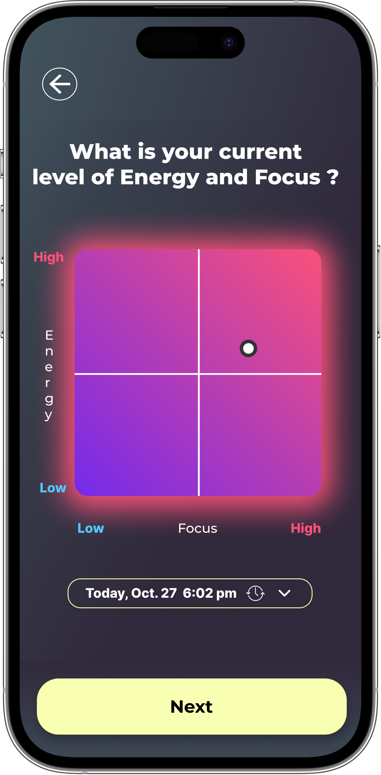
One of the most important interactions was going to be the Energy Log Screen . This is where the user will log their energy levels every day. This interaction needed to be simple, but also effective in capturing the user’s energy level and circumstances.
I created a few versions, but settled on two versions to test with potential users. The more simple, square version tested better and really seemed to make more sense.
Metrics Page

As I created the wireframes for the key screens, it became evident that creating engaging data visualizations was going to be key for the dashboard.
After showing my initial designs for the primary energy data visualization was confising and not workong for potential users. I would have to go back to the drawing board. But, I was getting good feedback from fellow designers and testers.
Energy Log
The Metrics Page would be the key place where users would go to understand their energy levels and make decisions on what to do to manage them for the best.
Though conversations with users, I understood that it was going to be important to give users simple explanations about their energy metrics and some simple visualizations.
Building on the foundation
I tested my strongest lo-fi designs to evaluate feature value, usability, and clarity of data visualizations. Through testing, I discovered that focusing on just two key inputs—energy and focus—made tracking intuitive and effortless. The quadrant chart proved to be the most effective way to present trends, while earlier concepts with seven factors were too complex and overwhelming for users.
UI Guide
Before moving into hi-fi wireframes, I refined the data visualizations and crafted the UI elements that would define the app’s look and feel. I wanted the interface to feel energetic and vibrant against a dark background, visually reflecting the app’s purpose. I chose pink/coral to represent high energy and blue to represent low energy, creating a design that both communicates and embodies energy balance.


Runners need help knowing how to take steps toward their goals.
One of the features that my users were most excited about was the suggested run goal. Currently, the Nike Run Club app has a feature where a user can set a custom distance, time, or speed goal for a run that they are about to do. Part of my expanded metrics feature is to sync with the users long term goals to create an AI generated run goal based on the user’s history, current ability, and upcoming goals. Users needed to be able to distinguish between these two run goal tasks and set the goal quickly and easily before a run.


The high fidelity version of the Sign-Up/Onboarding task flow featured a refined aesthetic and an option to be guided through your first energy log.
Many test participants expressed confusion over the the process of logging energy. To help solve this potential problem, I added a guided energy log as part of the on boarding process.


Energy Log Screen
The Energy Log Screen uses the more simple, square energy level picker that considers only the factors of energy level and focus.
The user can log just their energy and focus level, or they can scroll to select relevant factors or circumstances that they want to associate with this log. Additionally, there is an option to write a journal entry to further describe how they are feeling and what else is going on. The app will analyze the journal entry and factor it into the user’s trends and metrics.


Daily Metrics Page
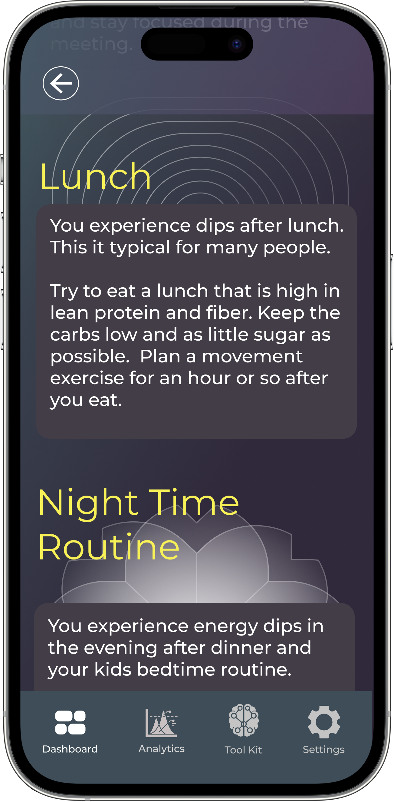
The Daily Metrics Screen shows an analysis of each day. Users can see each time that they logged on the day as well as noted dips and simple synopsis.
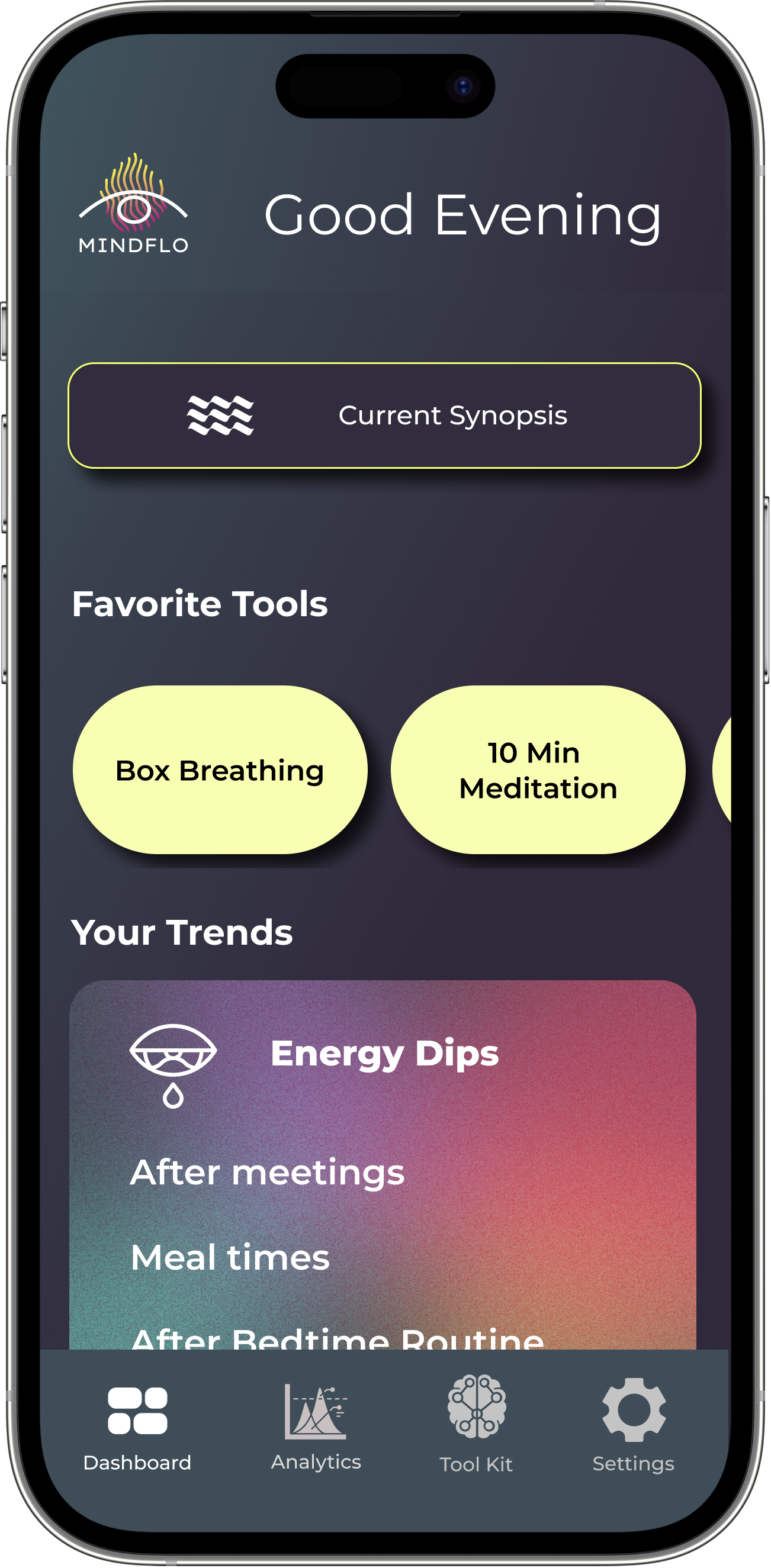
In the tools section, users can browse Breathing, Mindfulness, Movement, and Mental exercises. They can use these techniques to boost their mental energy and save their favorite exercises for quick access.


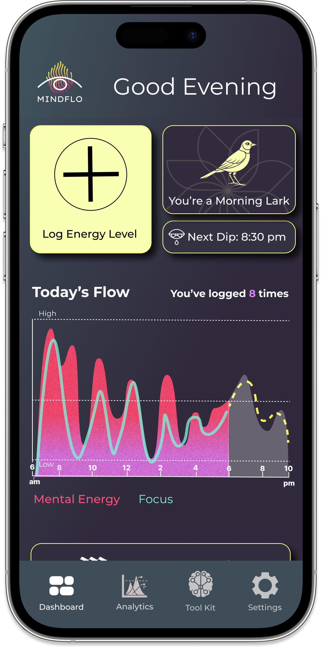
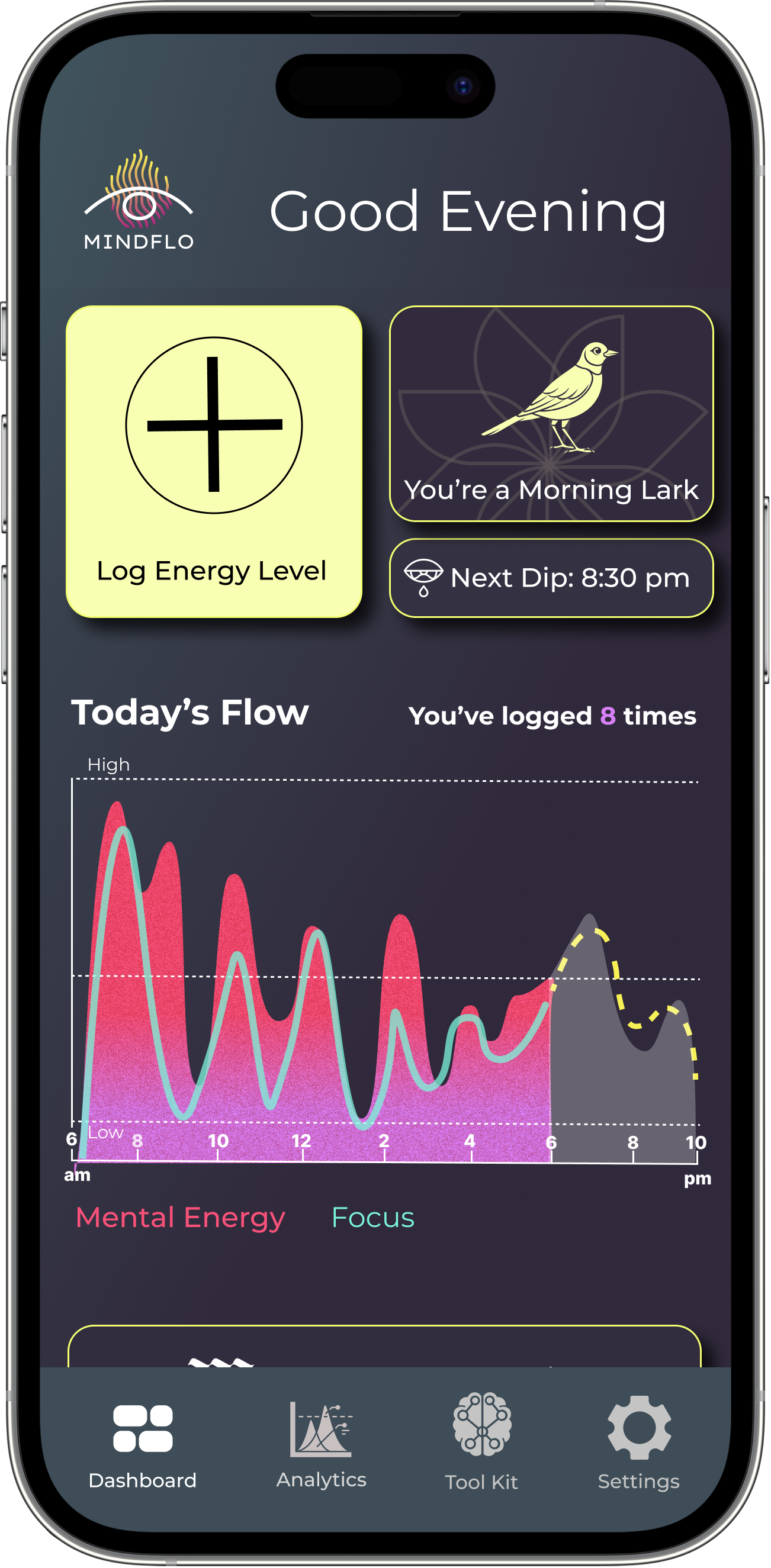
Dashboard
The Dashboard needed to be simple to use and contain quick to access and understand information about the user’s basic patterns.
The page features a large button linking to the Energy Log Screen and a visualization of the current day’s energy fluctuations, based on the user’s logs.
The Dashboard also contains short synopsis of the user’s trends, links to favorite tools, and a predictor of the next dip that they will hit.


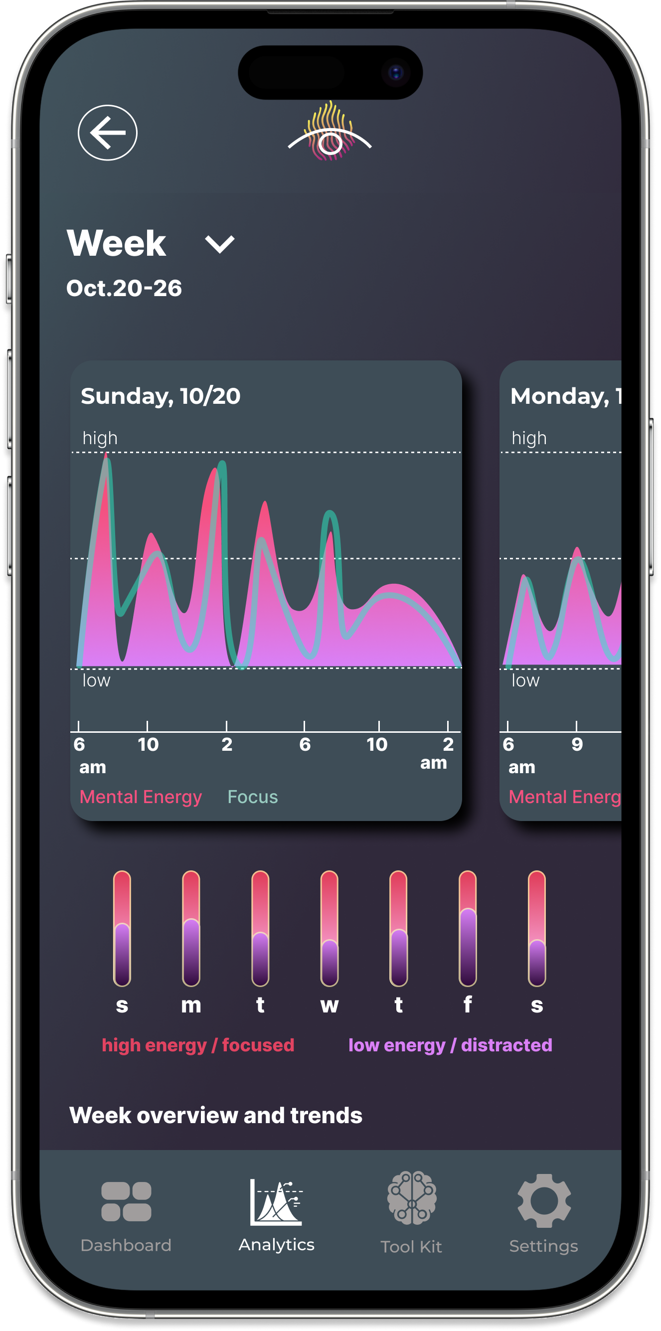
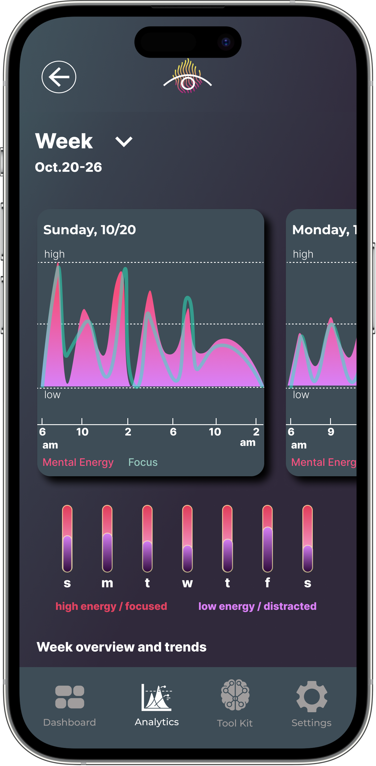
Weekly Metrics Screen
The Weekly Metrics Screen shows the user their weekly stats going back as long as they have been using the app. This page also gives simple synopsis of trends for each week.
On this screen, users can scroll charts of the days from that week and can tap on those days to access a more indepth look at each day.


Usability Testing Insights
To validate the functionality and clarity of the prototype, I conducted usability tests with 5 participants over the course of a week. Overall, the feedback was positive, with users responding well to the visual design and overall ease of navigation. However, the testing also revealed several areas of confusion—most notably around the notification setup screen, hidden scroll areas, and unclear interactive elements like the favorite icon in the tools section.
While users appreciated the analytics and summary content, some key features were overlooked, such as the ability to tap into individual days on the week view or access deeper insights from the dashboard. Testers also expressed a desire for more actionable recommendations, such as a quick daily trend summary or suggestions embedded directly into the tools and prompts. These findings helped clarify opportunities to enhance clarity, engagement, and personalization in the next iteration.
Refining
After completing the tests of the prototype, I created another iteration of the design before putting it through a round of feedback from colleagues. This iteration was about making adjustments that would give users the extra clarity and ease of use that they need as well as information on their energy flows and bringing the visual design up a level.

I added a “predicted flow” feature to the dashboard’s daily flow. This way users can see a prediction of how the day may go for them and get ahead of their energy levels.
Multiple test subjects were looking for easier to access and quicker to digest synopsis of their trends. I developed the “Current Synopsis” page to be more dynamic and engaging and added a card at the top that points out the tools that the user is responding the best to.
Almost all of my test subjects missed the fact that they could click on the days of the week in order to get to a more in-depth look at their trends for each day. I elevated the UI design of the the cards to make it more evident that they are clickable.
The most substantial change after testing revolved around the energy log. Test subjects were missing the fact that they could scroll in order to select and add factors affecting their experience.
To address this, I broke the energy log process into a two screen flow, requiring the user to first select their energy and focus, and the add the optional factors or journal entry.
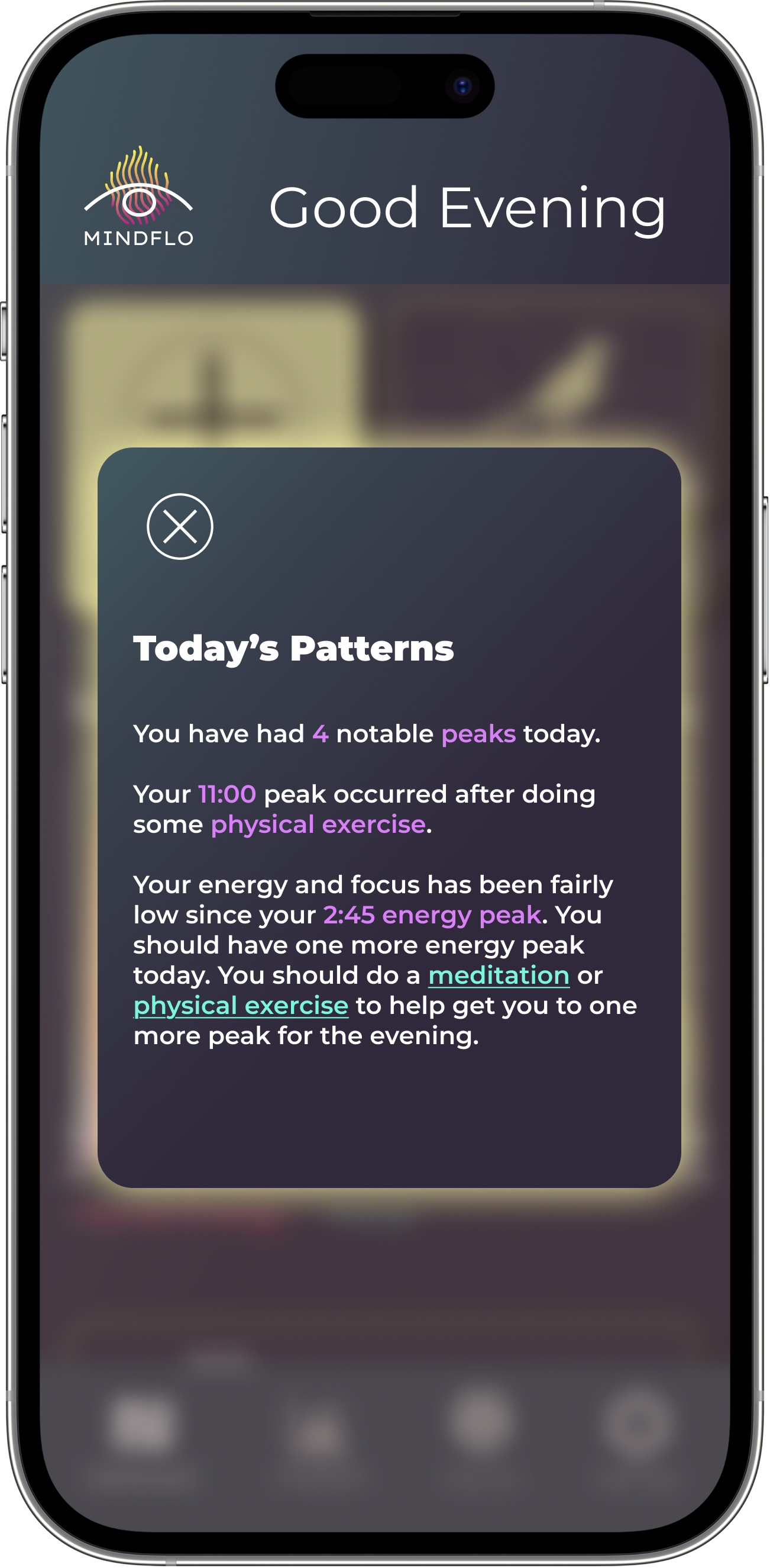


Many of my iterations after testing focused on bringing more depth and clarity to the user’s metrics and trends as well as direct access from the dashboard to this information. One feature added was a pop-up that appears when you first open the app.

I updated the icons associated with dips, to further link them visually with the chart of the day. Many users were reading. the blue squares as “unfinished” or confusing.
Final Reflection & Next Steps
Looking back on the Mindflo project, I gained a deeper understanding of how to design for users who need clarity and value in short, focused interactions. One of my biggest takeaways as a designer was learning to balance simplicity with depth—creating an experience that feels light and easy to use, while still offering meaningful insights and support. Through testing and iteration, I learned the importance of clear affordances, scannable feedback, and minimizing friction, especially in an app designed to reduce cognitive load.
I’m proud of how the core ideas evolved into a thoughtful, research-backed concept with real potential to impact users' daily lives. The process helped me grow in how I synthesize user input, manage scope, and prioritize features based on both user needs and business goals.
Moving forward, my next steps would be to refine the core interactions, particularly the energy logging and analytics navigation, and to explore new opportunities for deeper personalization and integration. I would also consider expanding the toolset based on user feedback, and testing additional onboarding flows to increase long-term engagement. Overall, this project reinforced my belief that the best wellness products don’t just track data—they guide, encourage, and empower users in ways that feel human.
