
Pack 149 is a growing Cub Scout troop in High Bridge, New Jersey, looking to improve its digital presence to better support both current families and prospective members. The existing website lacked clarity, engagement, and up-to-date content—making it difficult for families to find event information, understand the scouting commitment, or feel a sense of community. This project involved stakeholder interviews, usability testing, and iterative design to create a modern, easy-to-maintain website that balances two core needs: serving as an information hub for current members and acting as a compelling recruitment tool for new families.
Project Overview
Role: UX/UI Designer Tools Used: Figma, Miro Time Frame: 6 weeks
From “Where do I find that?” to “Let’s go!”
Parents shouldn’t have to decode a website to get their kids to a campfire.
I redesigned Pack 149’s site to be a one-stop hub for scouting info—making it easier for busy families to find event details, understand commitments, and feel the excitement of joining the pack. Because the real adventure should be in the woods, not on the homepage.
Research
Figuring out Needs
After my initial conversation with the Pack 149 leadership I spent some time looking at the websites of other Cub Scout packs and non Scouting related non-profits. I wanted to see how other organizations represented themselves and what the prioritized. I also dove into Scouting America’s website and their brand standards website.
I noticed that many Cub Scout and Boy Scout websites had similar, outdated or cumbersome websites, with a few standouts. Looking at other non profits provided a fresh perspective and inspiration for design for a non-commercial website.

I spoke with four key stakeholders and parents, including current scout parents, prospective scout parents, and adults who had past experience with scouting. From these interviews, I wanted to understand how people were currently getting information, what barriers existed for joining or staying involved, and how the website might better support both logistical planning and community connection.
I distilled my research into succinct problem statements in order to focus the direction of the design

Defining the Challenge

To bring the challenge into deeper focus, I grouped my research data into an affinity map in order to see patterns in the concerns of the users. From the patterns that I was able to see across my interview subjects’ experiences, common user problems began to emerge.


Insights through conversation
Through interviews with parents with kids in the pack, local parents without kids in the pack, and pack leaders; I came to understand that the website needs to serve two distinct but overlapping audiences: parents of current scouts and prospective scout families. While current parents need quick access to event details, forms, and pack updates, prospective families are looking to get a feel for what Cub Scouting is like—its commitments, values, and sense of fun. I also realized that leaders and volunteers often struggle to keep sites updated because the editing tools can be confusing or time-consuming.
The most frequently echoed needs were:
A centralized and easy-to-use calendar with event details and sign-ups
Clear explanations of costs, time commitments, and expectations for new families
Visuals and testimonials that showcase the fun and community of the pack
Resources to help parents prepare for events, such as checklists and uniform guides
A site that is easy to maintain so it stays up to date


The primary need that emerged from the interviews was to have a location to go to for information about pack activities. The pack members were communicating this information via text and emails and it would become cumbersome to look for those texts and emails days after they were sent.
“I want a single, definitive place to go for event details and pack info.”
— Interview subject, Scout parent
Parents struggle to find clear, up-to-date information about the pack’s events, commitments, and requirements, leading to confusion and missed opportunities for engagement.
Impact on Organization Goals:
Without a clear and centralized information hub, families may disengage from scouting due to confusion or frustration, and prospective scouts may hesitate to join if they can’t easily understand the program. This can lead to lower retention rates, missed participation in events, and decreased community involvement within the pack.
The current website does not effectively reflect the pack’s vibrant community, making it harder to attract and retain families.
Impact on Organization Goals:
A lackluster or outdated website can result in missed recruitment opportunities, as prospective families may not feel inspired to join. Additionally, a site that doesn’t celebrate achievements and engagement is a missed opportunity to show what is special about the pack.
Parents and leaders want an easy-to-use, regularly updated website with event sign-ups, checklists, and essential resources, but maintaining and updating the site is often difficult and time-consuming for volunteers.
Impact on Organization Goals:
If the website is difficult to update, critical information may become outdated or go missing, making it harder for families to stay engaged. An easier-to-maintain website would improve communication, increase event participation, and streamline volunteer efforts, ultimately strengthening the pack’s ability to retain and recruit families.
Bringing the users to life
From the data gathered from interviews and analysis, I developed two personas. I took elements from the perspectives and experiences of my interview subjects and imagined Francis and Jacob.
Both users want simplicity and clarity, but they’re coming to the site with different intentions. The design needed to support both journeys without overcomplicating the experience.
The current website was in need of compete re-thinking and refreshing.

Project Goals
Create a clear, engaging, and informative website for both prospective and current families
Make event logistics (dates, details, sign-ups) central and easy to find
Showcase the community spirit and fun of the pack through imagery and storytelling
Design a site that’s simple to maintain and update by volunteers
Calendar versions 1 and 2


Laying the foundations
Before devloping my first sketches and wireframes, I created a simple site map and some user/task flows based on the features I would need for a lean MVP.
After completing my revisited the pack’s current website, viewing it again through the lense of my user personas and with my project goals in mind.
Spinning Needs into Features
After mapping user needs, I developed a feature list and plotted them into a prioritization matrix. Essential features like the event calendar and FAQ section were prioritized. Delight features like a photo carousel and “what to expect” checklists came next. Future iterations might include Google Calendar integration, a community message board, or a members-only portal.

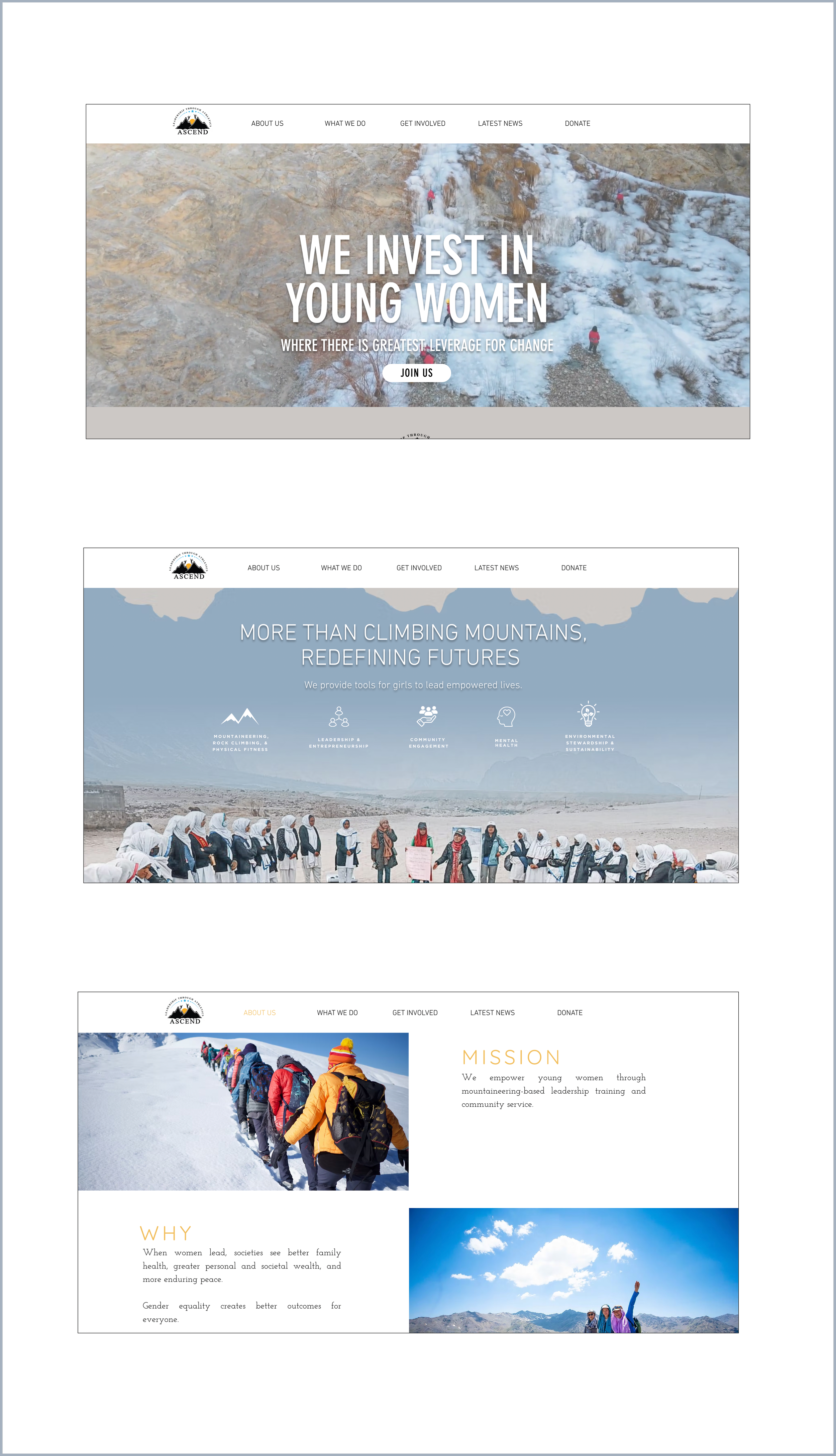
Lo-Fi
To begin, I crated Lo-Fi wireframes from some initial sketches. I used feeback sessions with collegues to widdle my ideas down two the two best for my primary screens: Home Page, About Us, and Calendar
Home Page versions 1 and 2


About Us

After creating Lo-fi wireframes, I did some A-B testing with collegues and my interview participants. I showed the wireframes to the Pack 149 leadership committee to show them the direction that I was heading in. This was a good opportunity to communicate to the key stakeholders how the project was coming along and to get their feedback early in the design process.
I quickly learned that low-fi wireframes caused some confusion when working with non-designers, as it was difficult for them to envision the direction of the design. I gained some valuable experience in communicating design ideas in meetings and keeping the discussion focused on usability at this stage.
Taking Shape
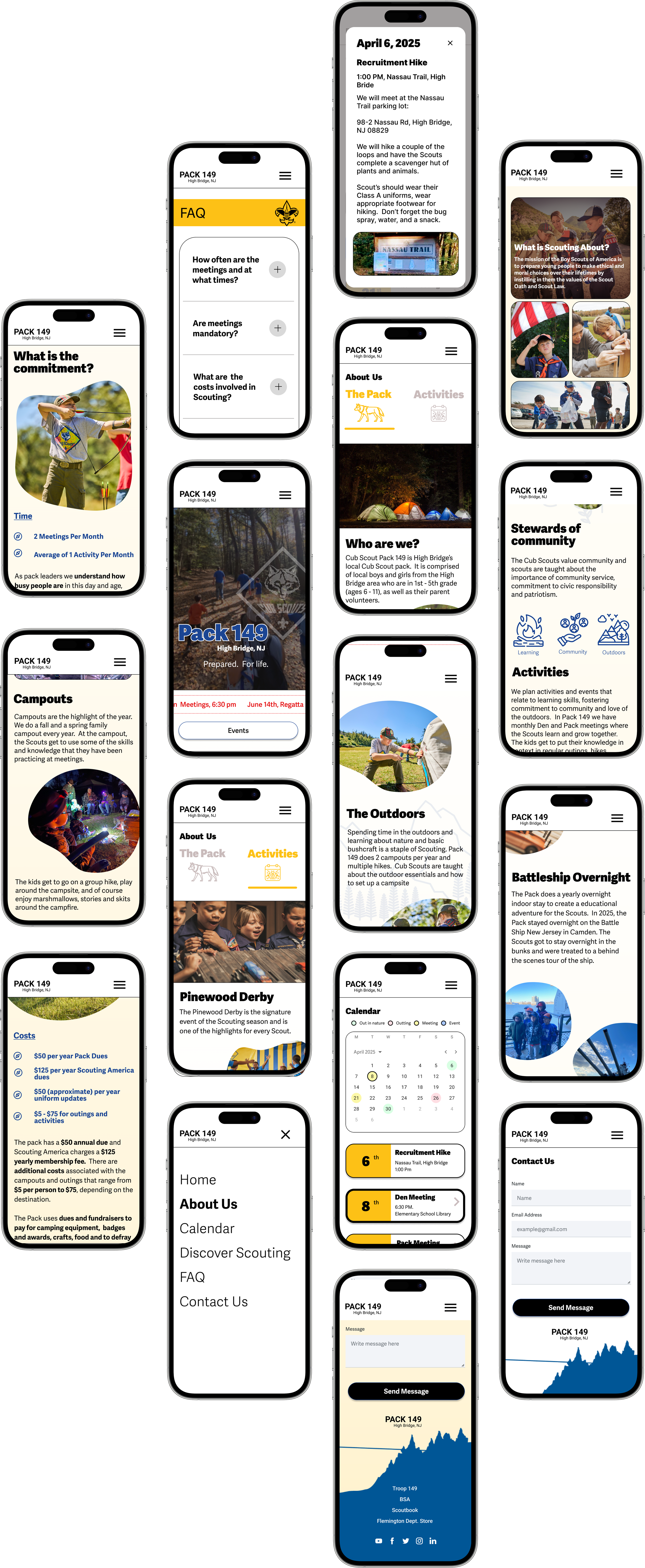
After testing and feedback on the Lo-Fi wireframes, I designed some Hi-Fi mock ups. I combined elements from multiple versions of the Lo-Fi wireframes that had positive reactions and tested well.

The Home Page is designed to showcase what the Cub Scouts is all about with an introduction to Pack 149. This page is the face of the organization and the first thing that potential recruit will see.
The Home Page features two spots to contact the pack and a ticker at the top featuring upcoming events.


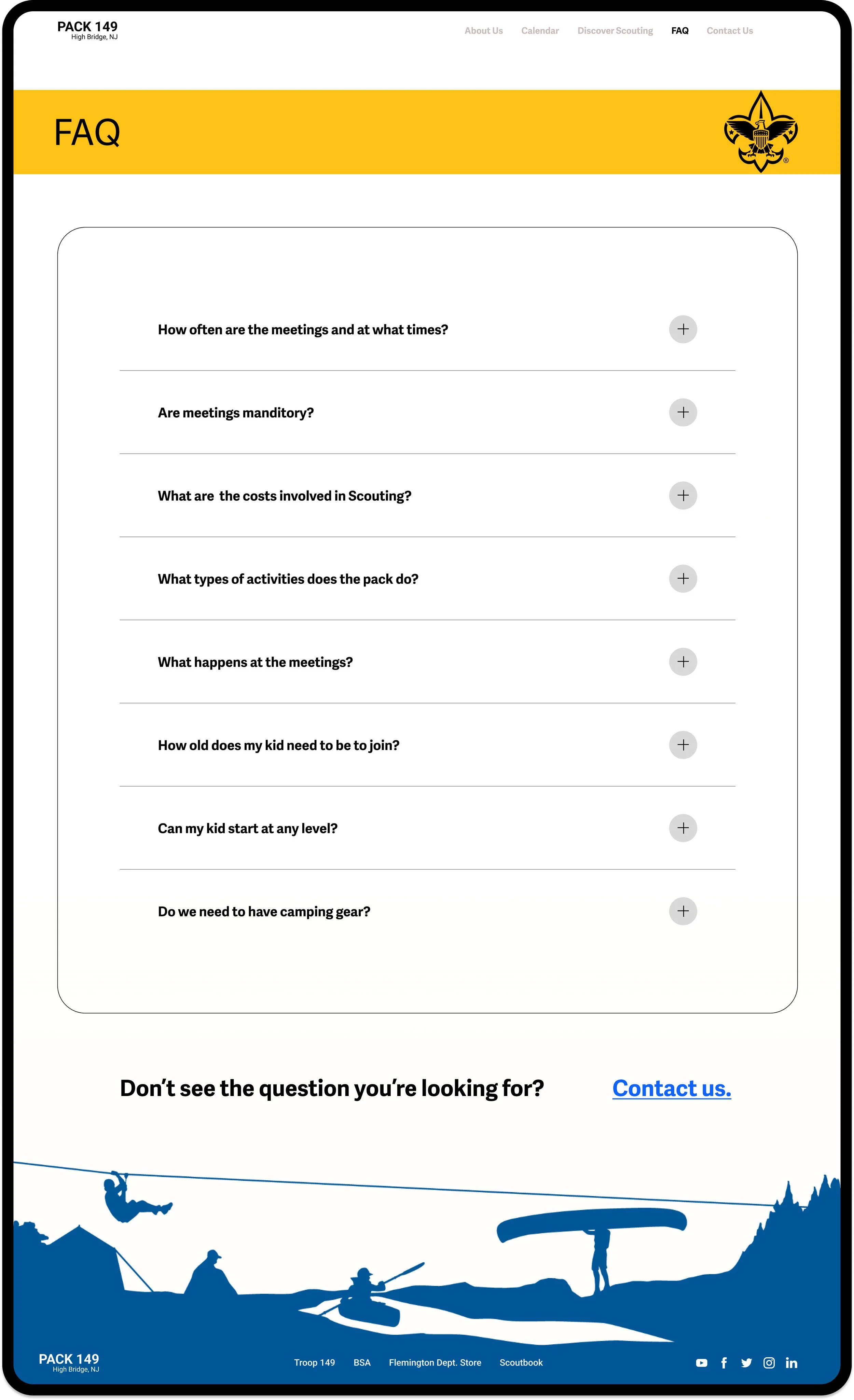
FAQ
Another key feature of the site will be the FAQ. This section will be important for recruiting. Both the current members and the parents of potential members stated that they don’t always know what questions to ask and specifically mentioned the usefulness of a FAQ section.
An important part of getting this page right would be getting feedback from users regarding the questions featured here, and what order to put them in.
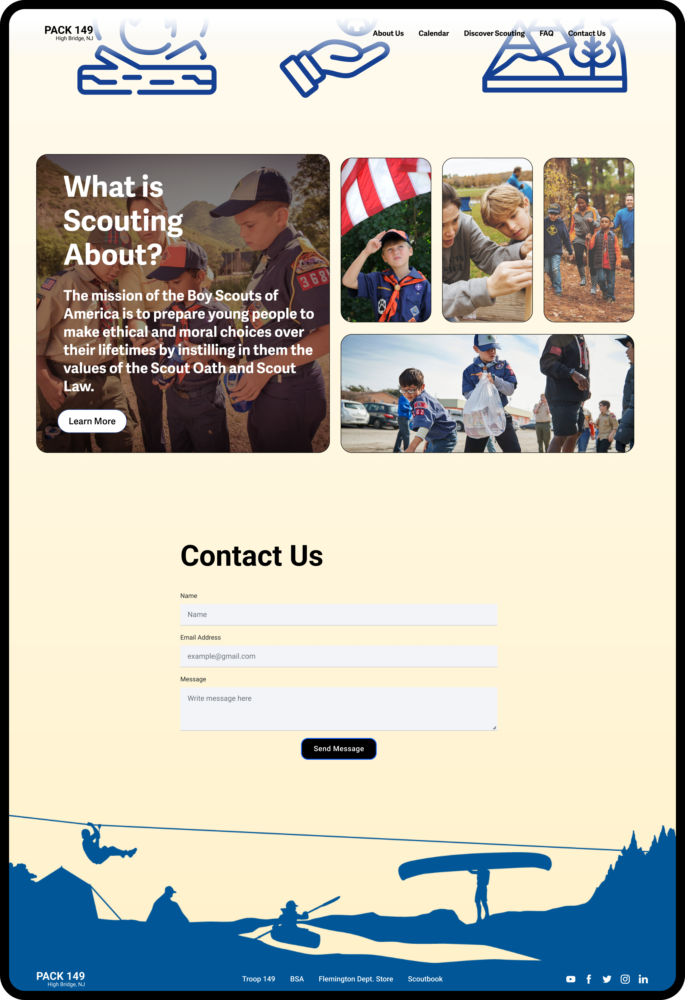

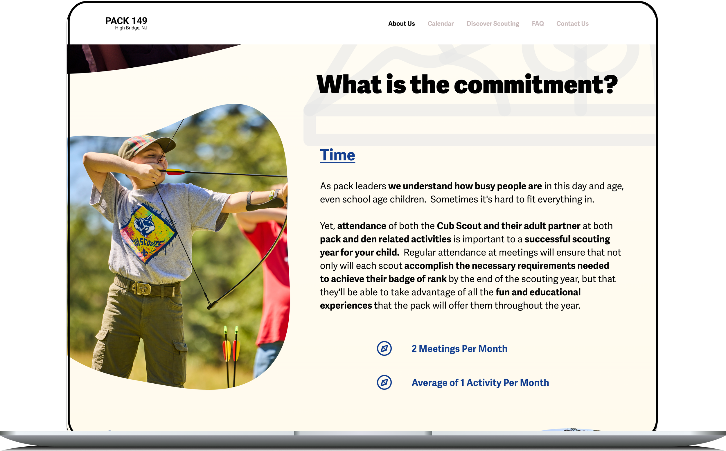
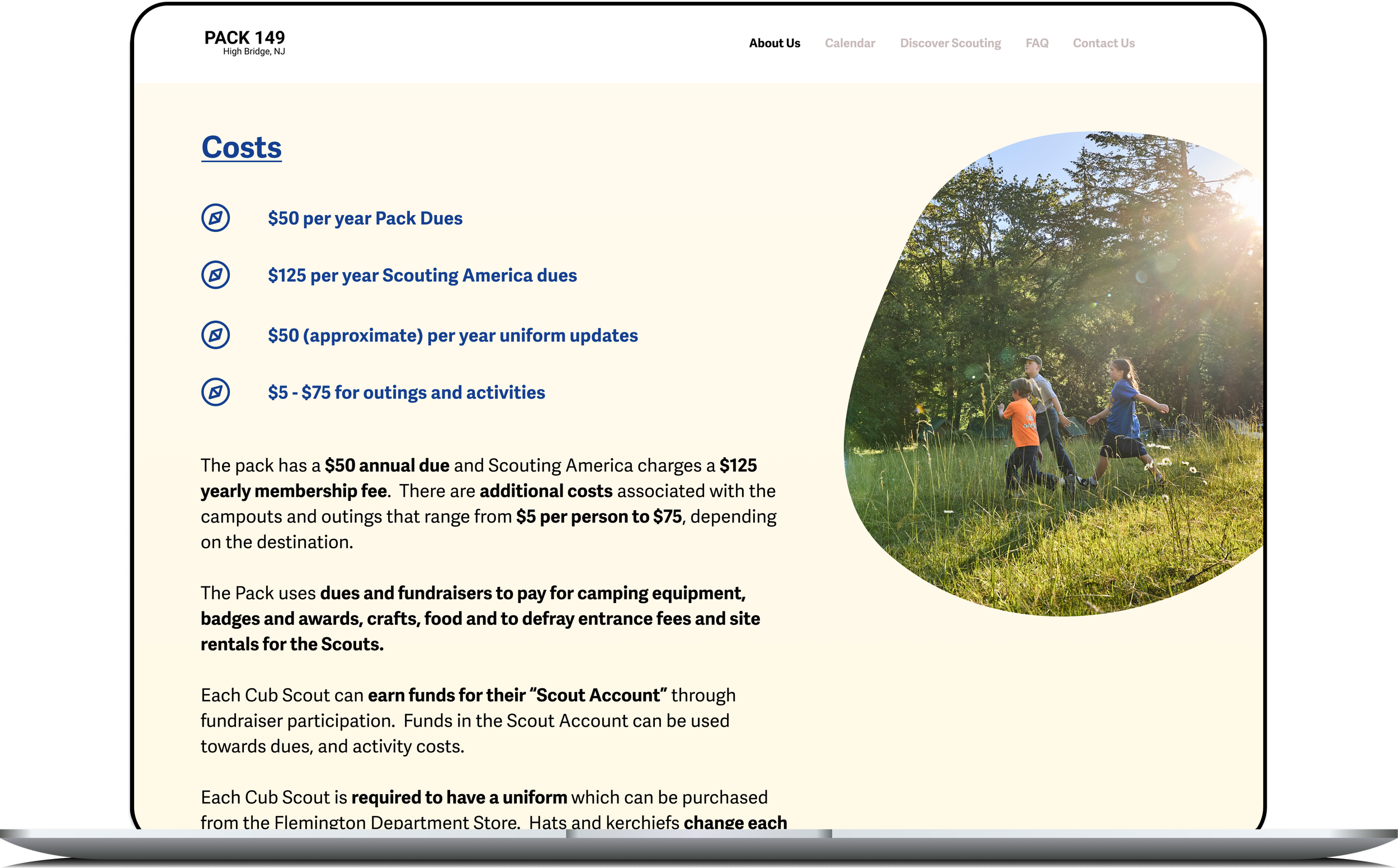
The About Us page is split into two sections: “The Pack”, which provides more detail about the pack and highlights the commitments and costs associated with joining.

The “Activities” section of About Us highlights some of the most popular activities that the pack does annually. In future iterations, there will be videos of the activities imbedded in the page.
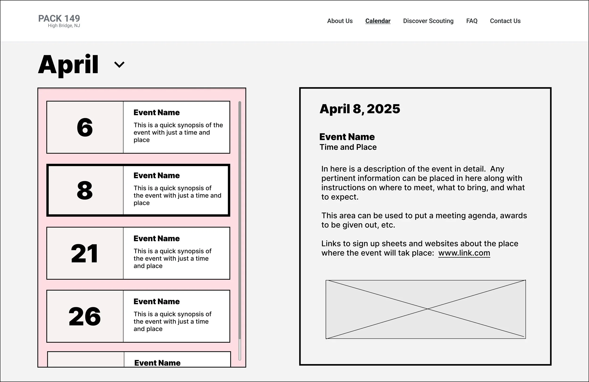
Calendar
The primary page that will be utilized by current members is the Calendar page. In Li-Fi testing, the users all stated that they preferred seeing the calendar in the familiar format so that they can see events in the context of the whole month and that they also wanted to be able to see all of the relevant details about the events and outings.
I decided to use both of the formats. The top of the page features the whole monthly calendar and below the fold, a feature that details each specific activity is featured.
Usability Testing Insights
I tested the prototype with five users. Overall, the response was positive—users found the navigation intuitive and the content relevant. Users went straight to the calendar for events, although some expected pop-ups from the calendar grid and had to be prompted to scroll down. Others struggled to find the cost info quickly, suggesting that the content layout of the About Us page needed work. Visual appeal scored high, but users wanted more imagery and a more exciting hero section.
At a Glance / Recommendations
Quick Wins:
Reformat the About Us section’s content for easier scanning
Add a visual key to the calendar color coding
Make the Hero section more dynamic and emotionally engaging
Increase imagery showing pack activities and diversity


Refining
After testing, I iterated on the design to improve usability and visual engagement:
Adjusted the calendar layout to reduce scrolling and added a color legend
Reworked the cost/commitment info into a more scannable format.
Replaced placeholder images with curated pack-specific photos and more consistent shapes
Redesigned the hero section to be a little more dynamic.

The organic shapes were well received by users, so I redesigned the the all of the imagery to be featured in organic shapes, bringing more consistency throughout the site.
I also tightened up the design spacing to create an ideal scrolling experience.

The Calendar


I redesigned the hero section to be more dynamic with a classsic image of the pack taking a hike.
I also changed the header to be solid, as the previous version was difficult to read upon scrolling.


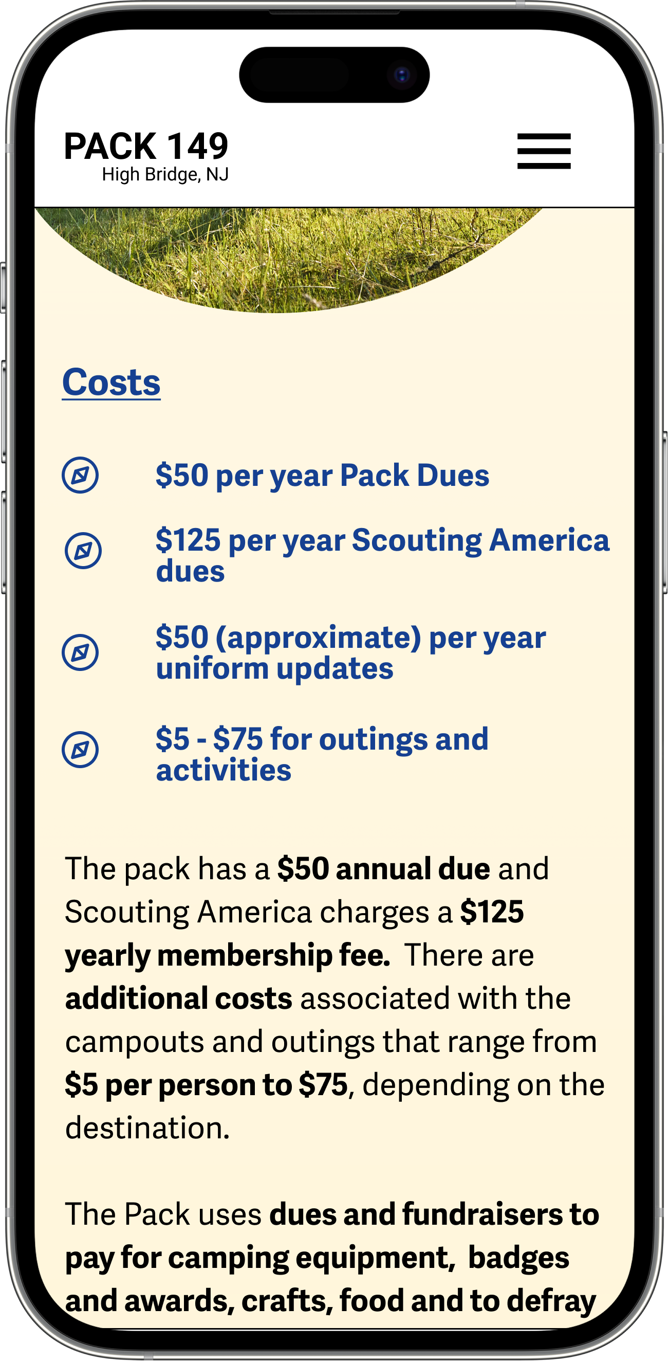
A major point of feedback that I received from user testing was that the “Commitments” section on the About Us page was a little hard to read. Users didn’t want to have to search for information or pick it out of a dense paragraph.
I addressed this by bolding key points of the text and breaking out the costs and time commitments into bulleted lists.

The Calendar page needed the most re-working after testing. Users wanted to see the context of the entire month and also wanted to have access to thorough details about the various activities and meetings. A main problem was that the test subjects were not scrolling on the calendar page to see the detailed cards for the activities. They were expecting a pop-up when clicking on the events in the calendar. But, upon scrolling, the users liked the style of the scrolling activities selector and information card.
So, I combined the best of both formats and created a bento-style calendar that featured a smaller calendar for context and also allowed room above the fold to see the activity selector and information cards for the activities selected. I also leaned into color coding of events and added a color key above the calendar to give users more ability to have an intuitive understanding of the activity landscape for the month.
Final Reflection and Next Steps
Redesigning the Pack 149 website was a deeply rewarding experience, both personally and professionally. Working with a real-world client taught me how to navigate limited stakeholder availability, balance differing needs, and lead productive conversations, even in short sessions.
One of my biggest takeaways was learning how to focus testing on usability—especially when working with users unfamiliar with design processes. I also gained experience designing for two distinct user groups: current scout families needing quick, reliable access to information, and prospective families looking for clarity, transparency, and a welcoming introduction to scouting.
The final design reflects the values and energy of the pack while solving real user pain points with features like an intuitive calendar, clear FAQs, and engaging visual storytelling.
As next steps, I plan to continue refining the site through ongoing feedback and iteration, especially exploring features for current members like sign-ups and downloadable resources.
This project reinforced my belief that good design brings people together—by making information accessible, celebrating community, and helping users feel more connected.